iOS 7 is now available to download (for free), and it radically transforms your iDevice. I took some screenshots from right before upgrading and right after, and as you’ll see, Apple cares about every last detail.
Here’s a before and after look at the home screen on my iPhone 4S; it’s a great example of just how big the changes are.
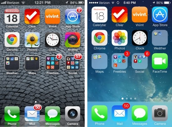 There’s so much new and different here. The status bar at the top is gone, allowing the wallpaper to extend all the way to the top of the screen. The red notification bubbles are just red circles now. The Dock at the bottom is wildly different; the glossy 3D look has been ditched in favor of a simple, translucent bar. Again, the Dock is very representative of the overall changes to iOS: photo-realistic depictions are out while more artsy, simplistic approaches are in.
Take a look at the Photos icon. The old one is a photo of an actual flower; the new one is a stylized, flat depiction of a fanned-out color palette. You can see how the new one was inspired by the old one; the iOS 7 icon has a flowery feel to it without being an actual flower.
Even the icons are different — and I don’t mean their artistic style. Their very shape has been altered, with a softer, wider curve on the corners. Here’s the old Evernote icon and the new one, side by side.
![]() Average users may not even detect a difference, but Apple cares about the tiniest of details. Here’s a better perspective on the new icon shape versus the old.
Average users may not even detect a difference, but Apple cares about the tiniest of details. Here’s a better perspective on the new icon shape versus the old.
![]() The black area represents the old icon shape that we’re used to from iOS 6 and before. The gray shows you the changes made for the new shape. It’s a very subtle difference, but the curve was rounded off more — and I’m sure there was an important design reason for it. Because that’s what Apple does.
The black area represents the old icon shape that we’re used to from iOS 6 and before. The gray shows you the changes made for the new shape. It’s a very subtle difference, but the curve was rounded off more — and I’m sure there was an important design reason for it. Because that’s what Apple does.
Here’s the iPad’s virtual keyboard, old on top and new on the bottom.
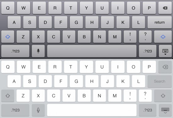 If you were to overlay these two, the shapes, spacing, and even the font used for the letter keys are all identical. The changes here is mainly in the shades of gray. The old keyboard had a slightly 3D feel, with shadows beneath each key. The new keys still have shadows but they’re so narrow they’re barely perceptible. There are some other changes to some of the icons, like the microphone, the “Hide Keyboard” button, the backspace, etc. And the blue on the Shift keys is gone, too. I’m not going to lie: it’s pretty jarring the first time you see it.
Now let’s take a look at some of the standard Apple apps for iPhone. First up, the App Store.
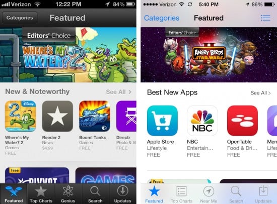 The new App Store design shows off the clean, white look that permeates iOS 7 across the board. But I think the most noticeable difference is how the different sections are spaced out. The tenets of good design teach that white space is an important tool in keeping the human eye from perceiving busyness. Spreading things out a bit gives the app room for bigger, more legible fonts, and lends it an overall cleaner feel.
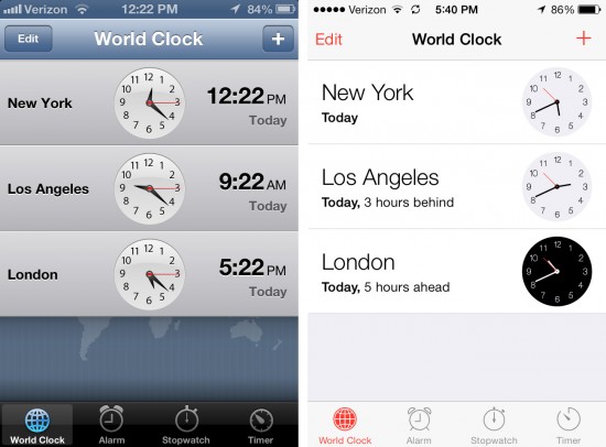 The new Clock app retains almost the exact footprint of the old, but utilizes those larger fonts and flatter colors and designs.
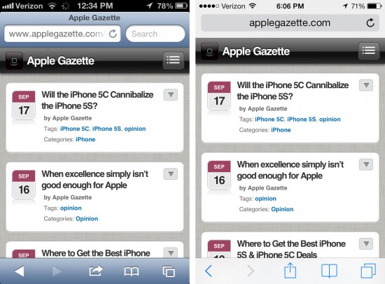 You might think that Safari has merely gotten a fresh coat of paint, similar to the Clock app, but there’s a lot more going on under the hood on this one. Most of the coolest new functions are hidden in the bookmarks and code that renders how web pages appear. But even this surface glance shows that Jony Ive’s mantra of “simplicity” has shown up here as well, and in more than just the colors and icons. Note how the top bar is more narrow than before, allowing for more of the webpage to be viewed; the navigation bars at the top and bottom also disappear after a few seconds.
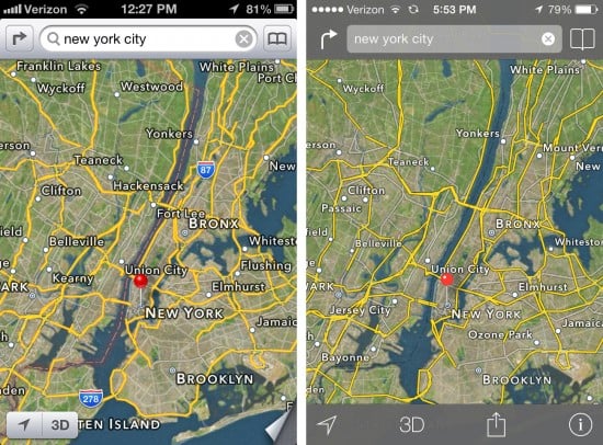 Bye-bye skeuomorphic page curl. Obviously, the biggest changes here are the navigation buttons and bars, but look at the map itself. Text labels have been toned down, so they don’t overwhelm the map, highway signs are gone at this level of magnification, and check out those yellow roads. Instead of a single, uniform width line representing every major highway, the yellow lines are now depict much more realistic roads. Bigger highways have thicker lines, smaller roads have more narrow lines. And look closely at the details of those roads; you’ll see an enormous amount of details have been updated to better reflect the actual geography. Clearly, Eddy Cue’s Maps team has been hard at work.
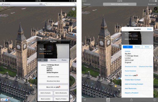 While the basic appearance of Flyover mode hasn’t changed, check out the new location detail view. It’s not just bigger, it’s got more useful info than before. I love the new Bookmarks function!
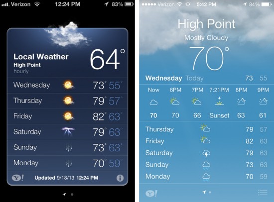 Now here’s an example of how flat design can be more aesthetically appealing than skeuomorphism. There was so much wasted space in the old Weather app. Now, the information fills the entire screen, with some lovely, slow animations in the background and more information at your fingertips. The old app made you tap to get more detailed views, such as hourly forecasts. The new app has those details right there where you don’t have to hunt for them, and they’re situated on a bar scrolls horizontally.
If you’re on the fence about taking the iOS 7 plunge, hopefully the care and attention that Apple has obviously put into its construction and design will help you make a more informed decision.




7 thoughts on “iOS 7: Screenshots Before and After”
Hi. Thank you for the excellent examples showing before and after images. Your examples precisely illustrate exactly why I truly hate the ios7 interface and think it looks like something from a kids coloring book. You mentioned “photorealistic depictions are in” while “artsy depictions are out”. I heartily disagree. I think the look of Apple’s new ios7 interface sucks big time, and I can’t imagine what is wrong with the minds of people that they can see any beauty in it. Such people must be blind. Now the previous interface, ios6, though not perfect, it was a work of beauty and it just doesn’t get any better than that. Even when I look at your examples above, I still feel the same way. The ios6 examples shown above are truly stunning to me and is more representative of the real world we live in, with realistic shadows and depth. Whereas, all the ios7 examples look like “a work in progress” and some kind of mockup from someone’s sketechbook who’s been roughing out examples of what they’re planning to do. And to further illustrate just how much I hate the ios7 interface, I just recently purchased my very first iPhone – a brand new iPhone 5 before they’re all gone – all because I love the ios6 interface. And if the look of ios7 is the best Apple has to offer, then I NEVER plan to upgrade from ios6 ever. Hey, I’ve been using a Motorola Razor for the last 10 years and I’ve never once upgraded from that. So for what reason should upgrade my iphone? I’ll just continue using io6 and my new iPhone 5 for the foreseeable future (for the next 10 years). And if Apple never comes to its senses and goes back to a more photorealistic interface, then I’ll just be happy I purchased my new iPhone 5 when I did, enjoy using it for many years to come, and enjoying ios6, which – after seeing ios7 – is about as good as it gets.
I can’t agree more with John’s posted comment above. I like a lot of the accesses and function of the new iOS system. However the colors are horrendous and make no sense. I can’t stand all the white space.
OK, Some can see the new UI Standards look cartoonish and “stunningly boring”. I suspect many many iPeople will wince and mutter in displeasure for a while, but Apple Design is a religion, and the Spirit of Steve is not something to curse at. Consumers will bite their tongue and trust it’s them, the consumer, that doesn’t get it, and that Apple is King of Cool.
Besides, the early ios consumers are getting older, needing glasses, hating glasses, and needing more screen contrast, better differentiation(edge-detection) and less layering of screen elements. Actually, that’s true for the majority of Americans and the Western World.
As the data and interactions we exchange via computers keep growing and getting more detailed and complex, the UI’s need to get simpler and out of the way. The mobile devices Apple is selling are optimized for rapid transactions of voice, video, text, and infinite types of push and pull requests for small pieces of information as we navigate knowledge, streets, relationships, investments, life, and entertainment options.
We don’t need or want lots of eye-candy on the keyboard or phone dialing pad, we don’t need to design different shapes of steering wheels or tires to get where we want easily. We agree on basics, some shapes and symbols and conventions and we get on with what we want to do. That is what this reductionist UI direction is about.
It’s like this: the Holy Grail of UI Achievement is to make the UI *disappear* so that the user (you and me, etc.) can simply experience and do what it is they really are trying to do. I don’t want dashboards & icons I can reach out and spin, I want my bank balance or feel like I’m sitting with a friend….)
It’s kind of like saying “Apple’s technology is not about Technology, and their design isn’t about Design.” It’s about the user and what they want. Which is kind of a strange thing to say about the main selling point of Mac/iEverything so far. The Packaging and UI *were* the selling points! Afterall, Pad Computers didn’t go anywhere until it got its UI Swag from Cupertino.
Nevertheless, it’s been a righteous religious creed in UI design that an OS and App UI is best modelled after an outstanding waiter or butler. Service professionals such as them excel at giving you what you want and need when you need it, prepping-it for you in advance, not requiring you to give it a single thought, only to reach out and grab the food and eat it…or the coat and wear it. Etc.
Ideally, you never see these service professionals while you’re busy doing whatever you want to be doing. You don’t need to find them, get their attention and spell-it-out for them. You don’t even want their help, you just want the food or the coat or whatever. You expect them to know when you are hungry and have the food ready, without you asking, whenever you feel like it.
That’s a long way from how people would describe using software has been like. That goes for the clunky Windows UI’s, and the clever & beautiful Mac UI’s.
However, now, perhaps, the iCandy Phase for All Things i maybe has reached the beginning of it’s end. It’s time to focus on services, transparent ease-of-use, on spiritual app experiences without wistfully admiring drop-shadows that change with the user’s orientation to the sun, and fonts that jiggle as we sing.
Something else about the flatter and more streamlined ios6 UI design: A flatter UI standard also makes sense with future product plans, if those plans happen to include much lower-cost versions of existing products, and new kinds of products than use displays that work *better* with more-streamlined, less-cluttered symbolic-oriented displays.
iPads on flexible plastic displays. iWatches that aren’t watches. iWear that isn’t just for your face. Displays you don’t touch, hold or wear. Interactions with people and things that don’t involve first reading, clicking, asking for or finding anything first….
The GUI is starting to vanish. And not just on computer-devices.
I think there is an emerging trend among teens and young adults to adopt a much more minimalist design aesthetic. With less emphasis on static images on their walls, less objects of symbolic value on their shelves, less clutter, and more on cleaner and more open spaces. They are beginning to have less attachment to objects, and place more value of streams of informational and social transactions. Symbols work well for them. They want to get to whom and/or what they’re getting to. They don’t need eye-candy of their keyboards or other devices. It’s the function they want, just give them a clue, and they got it.
The vibrancy of their lives, their relationships, their expressions of individualism, their statement of tastes, likes, what they need and what they don’t, isn’t as much reflected in what they physically have or who they are physically with, but in collections of digital assets, and through constant ephemeral interactions that leave only minimal footprints, like an message here, a photo there, playlists exchanged and contacts shared.
What matters to these next generations is not so much the fixed, but the fluid. Why use words, when a symbol says more. Photos are disposable. Those you want to keep are stored in the cloud, are lost track of on a flash-drive of DVD, or are valued mostly in the moment. How many of them will leave actual scrapbooks behind for people to cherish.
When I tried explaining to my daughter why I liked physical books, friends in the same room, holding a product before I buy it, writing a personal letter using paper and pen, keeping a physical scrapbook, her response was “Gosh, you’re so materialistic!”.
iOS 7 is an unspeakable disaster. sure there are some improvements. but in general it feel boring, weird, unfriendly and in general looks like a mistake.
but the worst thing are all the added transitions, animations, jerking, twitching, fading, zooming and other convulsions – i guess they all are part of “simplicity”. they overall make iPhone look and feel like an annoying, irritating and distracting jelly. the user experience turns into constant cringing. iPhone became something i just don’t want to touch and use anymore.
Could not be said better! In the world of computers/mobile device where iPad with iOS6 was almost the only close to perfect in terms of design and giving a pleasure to touch thing the outcome of new iOS7 is like a cold water. Update, upgrade, buy new device? NEVER AGAIN, at least until they go back which probably will never happen. Forget about tiny fonts, girlish colors etc., look at Photo app – all albums are now on white blinding background! The “designer” who did it must be an idiot. It looks with Steve’s gone the era of Apple is going to end.
These side by side photos do a great job of highlighting how iOS 7 fails to live up to Apple’s own stated principles and exhibits striking inconsistency.
We are told that 7 is an iOS for mature users who no longer need handholding and skeumorphism to guide them through applications. And so the new Clock app shows us analogue clock images that could have been created 50 years ago.
We are told that drop shadows and the illusion of depth have been forsaken for a much more layered approach. And yet the Dock, stripped of ersatz depth, is given no depth at all.
We are told that the purpose of the design is to get out of the way of the content. Yet the new Maps image you show strips away useful content in the highway labels that help to orient the user. Not to mention the huge step backwards the directions in Maps have taken in getting rid of the very helpfully skeumorphic green road signs. The thing is, in a maps app the road signs ARE the content. They should be front and center.
These and many more inconsistencies give the impression that 7 was a rush job. Hopefully it will be more coherent in the future.
“The status bar at the top is gone, allowing the wallpaper to extend all the way to the top of the screen.” Really? The side-by-side photos you show both have status bars at the top of the screen. I agree with other posters, iOS7 is too white, plain, boring. If you didn’t know better, you’d think the one on the left was the new, improved version over the one on the right. And when will Apple ever give Safari a real color other than gray? Seriously Steve, do we need to hold a seance to get Apple back to the top?