Apple is expected to unveil iOS 7 in a few days, and the big buzzword that keeps being mentioned is “flat design.” In case you’re wondering what that looks like, here are 10 beautiful apps from the App Store that show off flat designs.
So what is “flat design,” exactly? Abduzeedo defines it as “simple, flat, and typographical.” In other words, no textures that look like real-world objects, extremely scaled down, “un-busy” designs, and a big focus on stylish typography. Apple’s design guru Jony Ive is famously a disciple of minimalism; all of his hardware designs have emphasized beauty and minimal simplicity. So it should be no surprise that his first move after adding software UI design to his list of responsibilities has been to make some radical changes to the iOS design standards.
Many third-party iOS apps already use minimalistic flat designs, so in anticipation of Monday’s big news from WWDC ’13, here are some of the App Store’s best examples of flat design.
Clear
The bestselling to-do list app marries minimalism with wonderfully smart gestures for a pleasing, clean design. [App Store link: Clear]
ClearWeather

Flat designs are a dime a dozen in weather apps. Seriously, there are gazillions of them. I like how ClearWeather presents its data in a way that requires only one screen. [App Store link: ClearWeather]
Figure
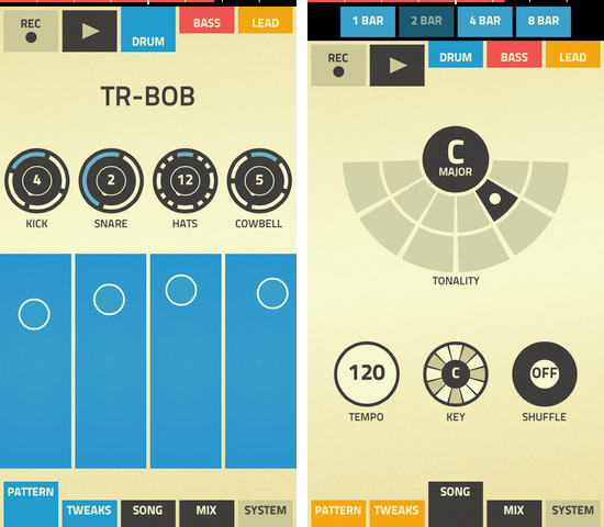
Propellerhead’s clever music-making app uses flat design to make a complex UI look gloriously simple. [App Store link: Figure]
Google Search
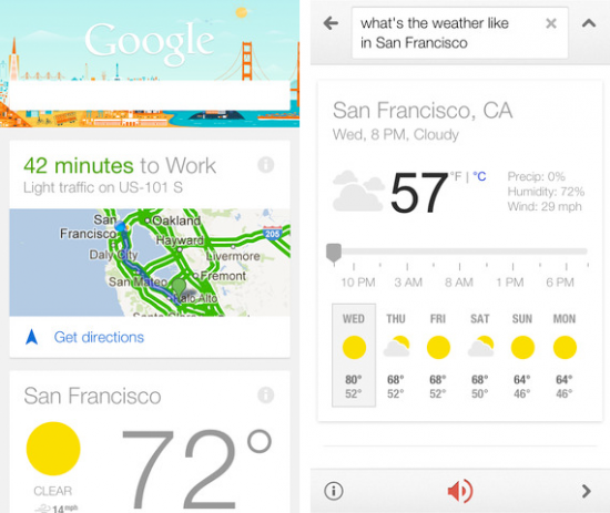
Google recently upgraded this app to include Google Now functions, and the results show off nice, easy-on-the-eyes visuals. [App Store link: Google Search]
Google Maps
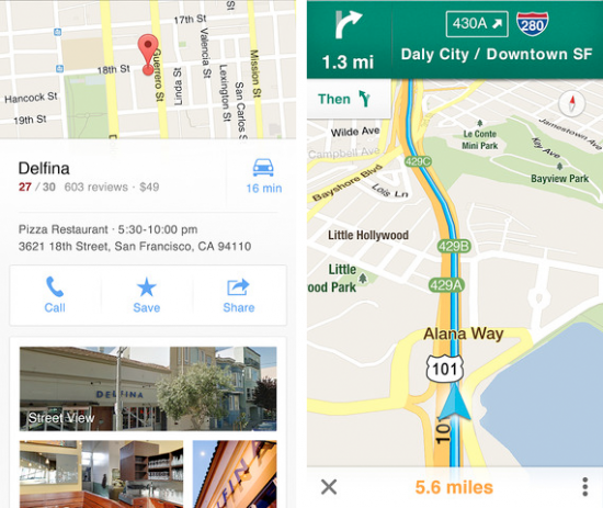
Even though it kinda pains me to say it, Google Maps has come a long way, aesthetically. When Google released its own mapping app, it surprised everyone by looking way better than Apple’s old version of Google Maps ever did. [App Store link: Google Maps]
Invy
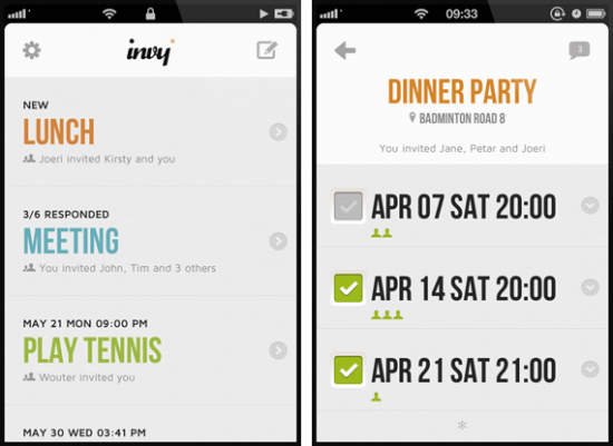
I love how this one manages to be visually pleasing without the use of a single image. (Well, there are some tiny icons, but you know what I mean.) The entire design is conveyed through smart use of color and modern typography. [App Store link: Invy]
Moni
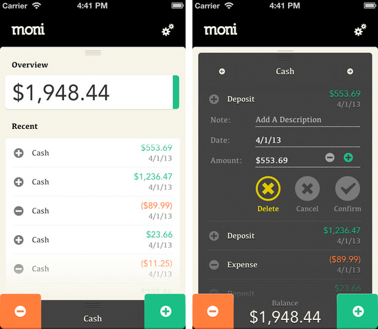
This appealing money-management app makes finances a snap. [App Store link: Moni]
Sitegeist
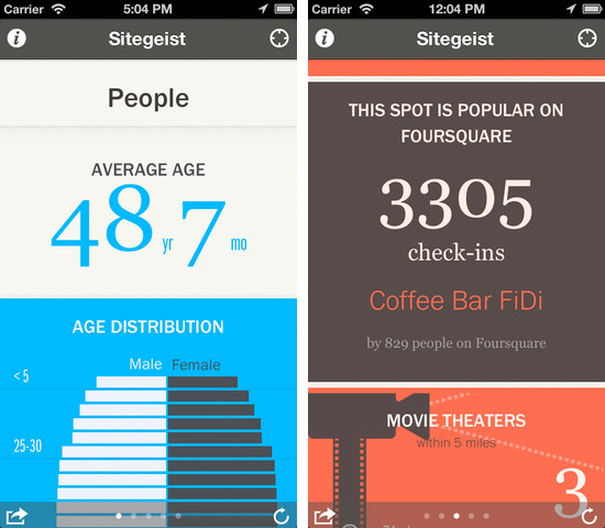
Sitegeist is an interesting app that shows you information about your current location, based on data pulled from numerous sources. It presents its data in a format that looks like a well-made infographic. [App Store link: Sitegeist]
Spelltower

There aren’t many games that use flat design, and the ones that do have to be puzzles (since that’s the only kind of game that works with flat design). Spelltower is one of the best. [App Store link: Spelltower]
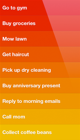
Start
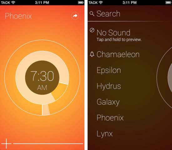
The colors of alarm app Start evoke a morning cup of Joe, while the typography was clearly inspired by Windows 8 phones. [App Store link: Start]
