iOS 7 is pretty darn awesome. I keep finding more things I love about it. But there’s one glaring oversight in iOS 7’s redesign: iBooks has been left out in the cold. What’s the deal?
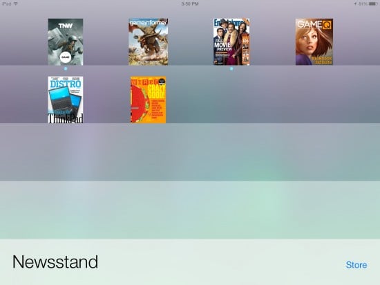
Fire up your iPhone or iPad and take a look at Newsstand. Gone is the old skeuomorphic interface with its fake wooden shelves. Instead, there’s a slick, minimalist stack of horizontal bars with subtle gradients. It’s far more modern and just plain better looking.
Now open iBooks. As you can see, iBooks still has the old wooden shelves just like always. So why didn’t iBooks get upgraded to the new iOS 7 design standards like Newsstand — not to mention every other built-in Apple app?
The most obvious answer is that Apple has always treated iBooks as something of an extraneous app, even though it comes pre-installed on iOS devices. But unlike Calendar or Contacts, for example, you can find the iBooks app as an optional download in the App Store. What’s more: iBooks is far from alone; it’s just the most noticeable holdout. There are a number of Apple’s own apps that haven’t yet been upgraded to iOS 7 designs, including iTunes U, Find My iPhone, Find My Friends, iPhoto, iMovie, and more.
So the real question is, why does Apple seem to be ignoring so many of its own apps, while asking third-party developers to update their apps to iOS 7’s design standards?
I have to assume that the task of getting iOS 7 done and delivered on time was so huge that some things had to be put on the backburner. No doubt all those extra Apple apps are in the midst of getting upgraded as we speak, but Apple will probably roll those updates out one at a time rather than rush them to meet a specific release date.
Still… It’s awfully jarring for Apple to take us from the sleek, modern feel of iOS 7 back to those outdated, skeuomorphic designs. It’s like getting only a partial upgrade. Hopefully these additional app updates will come sooner than later.


9 thoughts on “Why Didn’t iBooks Get Upgraded with iOS 7?”
MANY people LOVE the skeumorphic look of iBooks and don’t want it to be transformed into another stupid looking block of gradients and web icon thumbnails . your opinion is your opinion , but it’s not a majority opinion by any means
We’re all entitled to our opinion, yeah? I see Robin’s point as iBooks does look out of place with all the upgraded apps. I am a fan of skeuomorphism, though, so I am happy that iBooks still looks the way it does – esp. since it’s one of the apps that I use every single day.
It was about time to move forward. I truly enjoyed the “old” look, but I’m coming to terms with the new icons and interface. My five cents is that the boys down at Cupertino will be rolling out the new designs along with Mavericks, now that iBooks will finally find it’s way into OSX.Will they ever amalgamate both OS’s? That’s the million euro question…
Interesting that the Kindle update feels much more at home in iOS 7 than iBooks.
iBooks does not come preinstalled on ios devices. It is a recommended download upon first opening the App Store. If you care to test this restore your device to factory default and look for iBooks.
Let’s not forget that there is going to be a fall event to launch new iPads. It seems to make sense that along with the iPads they’re going to announce iLife and iWork updates.
My guess is that iBooks gets bundled with this
Aside from the look it would be nice to give iBooks some usefulness. I started using iBooks for repair manuals, parts books, and PDFs for work related items. Having hundreds of PDF manuals at my fingertips is great. But it wasn’t till after filling up iBooks that I realized how crappy of an app it is. How hard would it be to have a basic remaining feature. The search is useless with pdf titles that are numbers. The organization sucks. The options to send the PDF somewhere els after it’s in iBooks is lacking. Please give iBooks some love apple!
Now Apple has updated every app except ibooks. Ibooks looks god awful and it’s horrible to navigate large libraries. Seriously can’t wait for an update, don’t understand why it was left in the dark.
After using my iPad they has had iOS7 so me it came out, I used my wife’s ipad they still had iOS6.
Wow! It certainly looked a lot better.
The new interface just looks cheap and flat to me.
I never understood why anyone would want a $1000 ipad to look like a $79 Kindle…
I like the other improvements.
I am still keeping the old iBooks, I can’t stand the new one.
I like how the old one looks like a real book when you are reading.
It makes a big difference to the whole feel to me- obviously many don’t care.
But why not leave that old option in place for those that like it?
Some reason to keep everything flat and cheap?
Hey, maybe they could make the camera only do black and white and big block ‘dots’? That would be nice and flat and modern, wouldn’t it?