Guess what I got for the holidays? An iPhone 4s. Went to the bar, nonchalantly and yeah showed it to friends. This is coming from an Android guy (I had owned an iPad 2 but was never into the iPhone craze) who always felt that a single hardware button wasn’t enough for a phone. I think the one button config present in all of the iDevices “trained” some people to think that iOS has no multi-tasking whatsoever when in fact, it’s already way into different levels of multi-tasking. Perhaps not as obvious as how Android does it, but nonetheless multiple apps are really running. This is mainly due to not having a back button, which if you’re familiar with Android can take you several back presses to get to a “nothing” home screen whereas with iOS, all buttons lead back to Home.
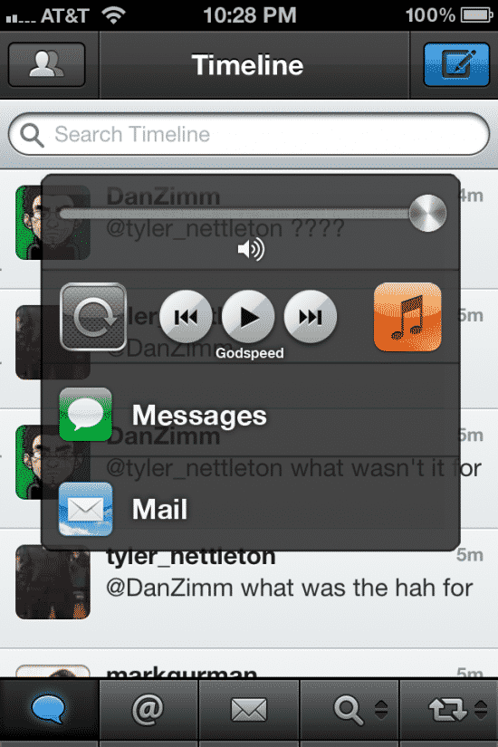
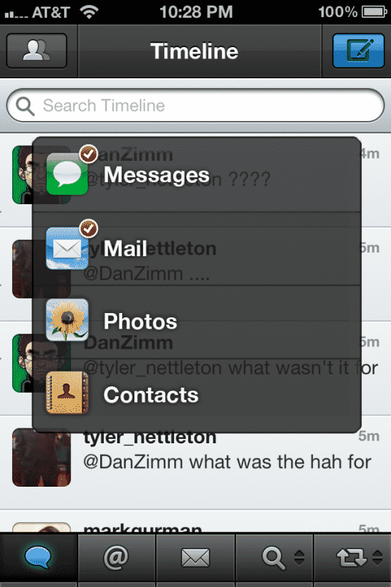
But I digress. Above is a screenshot made by iOS UI designer Josh Tucker. It’s a proposed layout of iOS inspired by Launchpad and after looking at this, you’ll see what I mean when we say that the current iOS doesn’t have any form of layer in its design save for the notification alerts. Apple has been known to use the signature clean look for iDevices but these screen proposals add a little bit more depth that feels much needed — even though a one button click leads you back to home, it may take several buttons to say, play a podcast, which is deeply embedded into the music app (customization moots this of course, but you see what I mean).
This design “frees” iOS by simply adding a small taskbar to the bottom of the screen allowing you to launch and deal with frequently used background apps such as the multimedia player, SMS, telephony and Internet. Do note that his design also removes the staple four icons allowing more space for menu apps (perhaps one horizontal row more) plus the task bar. Stopping apps is more fulfilling as well with crossing them out from the taskbar while they wiggle versus simply pressing the home screen. I think the act of putting an “x” on something versus leaving it for the menu really does tell your brain you’re fulfilling something.
That, or have Apple add more physical buttons.


5 thoughts on “A look into Josh Tucker’s Multitasking UI for iOS”
I disagree. One of the things I like about the iPhone is its simple design. It works just fine with one button and really doesn’t need to have the screen cluttered with static buttons.
Double-tapping the home button does this on iOS 5.
If you have followed the progress of multitasking from the 80″s to present you see sort of a reversal.
Limited hardware resources and unsophisticated software only allowed single tasking.
As more power and better software became available multitasking became possible. and made sense. Slower processors took longer to complete tasks so utilizing the processor to the max by slicing processor power made sense.
fast forward to today.
With so much power available tasks that took minutes to complete can be accomplished in fractions of seconds. So utilizing the processor (while still desirable) to the max is not as important for consumer use. (maybe for servers heavy usage etc)
So the question today becomes WHY DO I NEED MULTITASKING AND DO I CARE WHAT IS’S CALLED?
I don’t care what you call it as long as i can make a call and check mail or browse the internet at the same time. Listen to music and browse the internet. Have my gps running and talk on the phone etc etc etc.
So with all the power we have today and the sophisticated software we have maybe multitasking will take the form of serial programs that run and stop, run and stop, run and stop.
So is that multitasking or just “it works just fine for me so i don’t care what they call it”
The point being is that i don’t care what it is called being able to do multiple things at the same time is the goal what you call it or how you do it matters not to me.
And the other thing i don’t want to have to manage it thats what computers are for.
So i think apple is on the right track and i think google is on the wrong track.
Apple also allows multitasking in certain instances. All system apps multitask. GPS you mentioned. Any app can download data or files in the background, IM can poll for new messages. Did I forget any?
Looks like Android hardware manufacturers have made up for battery life issues by making the screens bigger and bigger. That’s one way, I suppose. Apple’s been very careful to minimize power consumption for the sake of battery life.
It wouldn’t hurt to have a somewhat bigger iPhone, though. How about a choice of two sizes?
Evening,
Thanks for the article — I’d recommend using the images that correspond with the article. The pictures that are included in this article are not related to the Launchpad design whatsoever.
Also, I encourage you to thoroughly read through the Tumblr posts that correspond with my Launchpad-ish multitasking design for full clarification. It will answer a lot of your questions and points of confusion, plus will elaborate on what is truly going on.
Thanks.
Regards,
Joshua Tucker