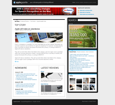
Behind the scenes we’ve been working on a number of new features for Apple Gazette, including a new design for the site. Design Disease has put together a fantastic new design for the site, and you can take a look at it below (click on the image for a ridiculously huge version of it to see what it will look like in your browser).

The new design is meant to make it easier for more important stories to be featured (for example, I hate pushing down a major story to post about a minor software update or something like that). It also lets reviews stay on the main page longer, and through the newswire section, I’ll actually get a better idea of the types of stories the community prefers to read, which I think will help make the blog a better, and more entertaining experience.
There are more features and things that we’ll discuss later, but right now I want to know what you guys think. After all, this site is nothing without your readership, comments, and feedback. So please take a few seconds to vote in the poll below and let me know what you think, and feel free to sound off in the comments below.


17 thoughts on “Reader Feedback Request: The NEW Apple Gazette.com”
I say if you can keep the way it is, but be able to have a select story on trop, that would be ok. but it feels like there is just one story and you cant view other stories with out Looking for a story that you already know exists. I like to be able to scroll though and look for stories. but the sidebar looks good.
I love the new design, it’s going to look great!
@Michael
Thanks. I’m really looking forward to launching it.
LOOKS GREAT. I was wondering when you were goingto get rid of all those categories.
@David
At the bottom of the main page there is a section called NEWSWIRE, in the final design there will be a “more>>” link in that section which will take you to a page with the news presented as it is now. So everyone should be happy.
🙂
I voted Neutral as, for me, usability outweighs the visual aspects of a site. From the screenshot, it looks like it’ll be very nice, but without actually interacting with it, I’m keeping my opinion at the moment.
Hey the site looks good. What happen to you doing a video podcast?
@Jw Illinois
We’ve been working with one of the larger online networks to launch the show with them, but there have been delays. If that doesn’t get finalized in the next week or so we’re just going to launch it independently with the new site design.
One way or the other AGTV will begin its regular schedule in a few weeks.
I really love the design. I think the black background on the sidebar is a big improvement. Small, but nice change.
nice
Just perfect. I love it. It’s clever. But, in the four major sections above what are “The Rants”?
@The Wizard
That will change. It will probably say “Featured Commentaries” or something to that effect.
It’s for the mouthy opinion pieces that I write a few times a week.
😛
The look is good, but the fonts to small, my eyes aren’t what they use to be. Also the scrolling of articles is better the way it is. The single article makes the site far less useful. In fact I prefer a list of articles, titles, with a short synopsis to let you know if you want to read further. Clicking on the title allows you to read the entire piece.
I prefer the new look without all the categories on the side, much less clutter. Good start!
Also I like “rants” as apposed to “Featured Commentaries” why be so staid!
@iJavaJoe
The font will be the current font, not the font shown in the mock up – sorry I forgot to mention that!
I think when we’re finished the readers who don’t like the front page will be able to go directly to the /newswire page and still be happy with the layout.
and you might be right about the “rants” thing – I might have to do another poll about that.
😛
the new layout looks promising. will there be a mobile version for the iphone/ipod touch?
btw: there’s a typo in the advertisement ruler beneath the search bar. the “d” in “advertisement” is missing
@georg
Thanks for catching that on Advertisement. I hadn’t noticed.
I’ve been thinking about doing an iPod Touch/iPhone version. The iPhone SDK’s version of Dashcode provides some excellent tools to make that happen.
Hey Michael — just to let you know there’s nothing wrong with the web design. I’m really used to the black-and-bluenes of applegazette, so swaths of red and green surprise me — but I guess we all have to move on to a wider world.