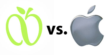
Apple and the city of New York are having a bit of a spat over the new GreeNYC logo. Apple feels that the new logo is too similar to their own logo and have made a formal attempt to block the trademark that the city has filed for the new logo.
Now, before we get into it, it is important to mention that any company that feels there is even a remote chance of the trademark being violated has to make an active effort to defend it, or risk losing their own trademark license.
Now, having a said that – I’m not really sure that Apple has anything to worry about here. You can see the two logos above.
What do you think?


17 thoughts on “Does the new NYC logo infringe on Apple’s trademark? You be the judge.”
Apple gets sued 10 times a day, when Apple turns the table, everybody bitches. What’s up with that?
No Apple has nothing to worry about.
It’s an apple. It’s not Apple. Not the same or even close. Quit ‘yer bitchin’ Apple.
Under U.S. law, if one wants to retain the rights to a trademark or logo, one needs to vigorously distinguish it’s proprietary properties. The classic case for this was “Kleenex which, for a time, was used interchangably with “tissue”. So I have no problem with Apple filing the lawsuit. They are just doing their due diligence. Having said that, I see no resemblance between the two apple logos. They are clearly different and distinct.
I agree i looks nothing like Apple’s logo. But neither did Apple Records logo. Apple Inc. lost that battle, so they have to protect their intellectual property.
I think it looks a little like it, but not close enough to sue over it.
So which is which?
apple needs to chil
No, Matt… Apple does not need to “chill”. Scroll up and read Falkirk’s post, as it explains exactly why Apple is, and *should*, be filing the suit. It is unlikely that Apple believes this case will go anywhere but, as Falkirk points out, they are performing due diligence on their trademark.
I don’t think Apple is worried at all about the logo.
This is just their chance to get some free press, as any press is good press.
Nah. For one thing it’s an apple. It’s not they didn’t exist as fruit before steve jobs created the company. Not like they weren’t calling NYC the big apple before steve jobs created the company. Even if it is similar it’s not like there’s going to be any loss of business. Hopefully we won’t have a rash of stupid people going to NY to buy computers.
Is it possible that the lawsuit is about a logo that Apple has not used yet?
Possibly they created a logo for a new product or they created logos with copy-writes to prevent others from using logos based on an apple.
Trademarks laws about possible confusion – as the author notes, part of it is if they don’t sue, someone will come with a blue Apple with a leaf and say, Apple didn’t sure the other company, they gave up that right … just like you can’t decide to sell a detergent called FIDE using a slanted giant orange typeface … or MOCA COLA using a cursive script … it does not help the NYC’s cause to have the A as part of the design. It’s NOT a very well thought design since it’s NOT based on any similiar NYC Apple logo … Everyone here knows that would be some knockoff ipod Apple logo on the left but to the ‘average’ person? That’s the litmus test. If the logo clearly said something like NY CITY GREEN INTIATIVE underneath, I think Apple would let it go but just appearing by itself, too similiar and I honestly don’t think it will pass muster. NYC is doing a survey to see but I’ll bet you show those two logos above to your aunt or the average person, they will say, Apple (Computers).
I have no trouble distinguishing the two logos. That being said, I think NY came up with a very nice apple logo, and Steve would agree in private.
I think they are too similar and agree that Apple should sue. Look at the rightward slant of the stem and the shape of the leaf and the angle of the leaf and the dimple at the bottom of the apple and the overall proportions. If I were a logo designer I’d probably find several other points of comparison.
Look at the logo for Apple Vacations
https://www.applevacations.com/index.do?command=showHome
It has a different shaped leaf and incorporates text as well.
One word: overreacting….
What Falkirk, Evil Closet Monkey, and JBelkin said.