
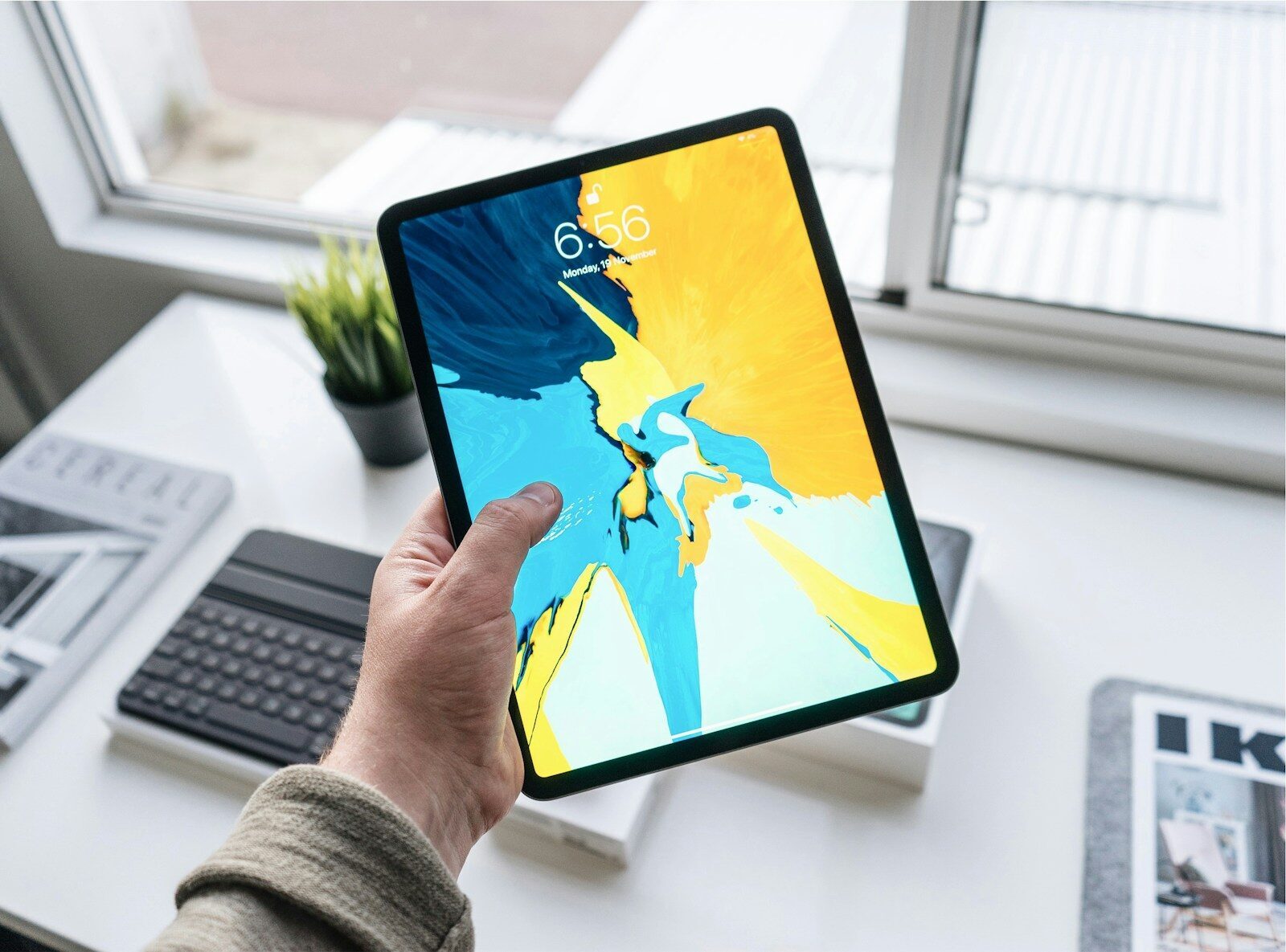
Open the same app on an iPhone and an iPad side by side and the gap usually shows up within a few taps. On the phone it feels fine. On the iPad it looks like a stretched phone screen, a single column floating in the middle with half the space doing nothing. The app works, technically. It just doesn’t feel like it belongs there.
That’s the whole problem with treating an iPad app as a bigger iPhone app. People reach for an iPad when they want to sit with something for a while: reviewing documents, sketching, filling out forms in the field, working through a patient chart. Those sessions are longer, the screen is bigger, and, since iPadOS 26, the window an app runs in can be almost any size the user drags it to. All of that changes decisions about layout, input, architecture, and testing.
What follows are those decisions in the order they tend to bite: the ordinary things that decide whether an iPad app holds up in daily use or only in a demo.
Start with the work the iPad has to support
A quick-glance consumer app and a tool someone uses for two hours at a desk have almost nothing in common beyond the operating system, so before any layout question, name what the app is actually for on this device.
Content-heavy and professional apps are where the iPad earns its keep. A field technician logging inspections wants large tap targets and offline entry. A clinician reviewing records wants dense information they can scan without endless scrolling. Each implies a different default layout, navigation model, and set of assumptions about session length and connectivity. Get this wrong and you end up designing a phone screen and hoping it scales, which it rarely does.
This matters as much for the team building the app as for its users. A product group shipping an internal tool, or a firm handling iPad app development company in Dallas for a regional client, still has to answer the same first question: what is this app for on this device, and who is using it.
Design for a window that changes size
On iPhone you’re mostly designing for a known set of screen sizes in portrait and landscape. On iPad, especially with the windowing system Apple introduced in iPadOS 26, an app can run at a wide range of sizes at once. Users resize windows freely, tile them beside each other, and arrange several apps in one space, much closer to how a Mac behaves.
A fixed layout built for one width will break under that. Size classes are still the tool: they describe the space your app has as compact or regular in each direction rather than as a pixel count. In SwiftUI that means reading the horizontal size class and letting layouts reflow, so a three-column view can collapse into a single navigable stack when the window narrows.
Picture a master-detail screen when someone drags the window to a third of the display. Does the sidebar tuck away and stay reachable, or shove the content off screen? The return of Split View in a later iPadOS 26 update, alongside the new windowing, means people expect apps to survive being squeezed, split, and stretched without losing their place. Apple’s Human Interface Guidelines go deep on this adaptivity, and the bar to clear is keeping the user’s context when the window resizes.
Input is more than touch
On an iPad set up for real work, touch is often the least-used input. Someone with a Magic Keyboard attached drives the app with trackpad and keyboard for long stretches, and an app that ignores that feels broken even when every button works.
Keyboard support means real shortcuts for repeated actions, arrow-key navigation through lists, and a tab order that makes sense in a form. Trackpad support means pointer states that respond as the cursor hovers, so the interface confirms what’s clickable. Drag and drop, within your app and between apps, is something iPad users expect for moving files, images, and text.
Apple Pencil deserves a specific caution. It matters enormously for drawing, note-taking, annotation, and markup, and barely at all for other apps. Support it where it fits the work, and remember that Pencil support varies by iPad model and by which Pencil the device accepts, so you can’t assume every user has one.
Accessibility runs through all of this. Dynamic Type, VoiceOver, sufficient contrast, and a sensible focus order decide who can use the app at all, and they overlap with good keyboard and pointer support anyway.
Architecture that survives real use
The interface is what people see. The architecture decides whether it keeps working on day two hundred, and it’s where the scope of an iPad project tends to be larger than a design mockup suggests. Coordinating discovery, interface design, Swift engineering, API and backend integration, QA across devices, and App Store release is a lot to hold together, and teams missing one of those pieces internally sometimes bring in outside iOS app development services to cover the gap while their own people keep ownership of the product.
Most new iPad apps are built in SwiftUI, often with UIKit mixed in where SwiftUI doesn’t yet cover a case or where an existing UIKit codebase is being extended. That interoperation is normal and expected. SwiftUI hasn’t made UIKit obsolete. The choice usually comes down to the specific screen and the team’s existing code rather than a verdict on which framework wins.
Underneath the UI, the questions that decide reliability are familiar ones made harder by how people use iPads. State management has to handle an app that gets resized, backgrounded, and resumed constantly. Local storage and a sync strategy matter more than on phone, because iPad sessions often begin offline, in a warehouse, basement, or plane, then reconcile cleanly when the connection returns. Performance has to be verified on more than the newest hardware, since a supported older iPad has far less headroom.
Security sits alongside all of it: how you store credentials, how you handle sensitive data at rest, and how the app behaves on a shared or managed device.
Planning for business and enterprise deployment
Consumer apps ship to the App Store and that is mostly the end of the deployment story. Business and enterprise iPad apps are different, because the device is often not the user’s own.
Managed devices change your assumptions. An iPad handed to a nurse, a driver, or a field inspector is frequently enrolled in mobile device management, restricted to specific apps, and subject to IT policies your app has to coexist with. Authentication may run through single sign-on rather than credentials you control, and permissions and audit trails may be a compliance requirement, especially in healthcare, finance, and logistics, where who did what and when has to be recorded.
Offline behavior stops being an edge case here. A logistics app used in a loading bay, or a healthcare app used in a building with poor signal, has to let people keep working and sync later without losing or duplicating records. That reconciliation logic is often the hardest part of the project.
These realities apply to any team shipping into regulated or field-heavy environments. A product group building an internal tool, or a vendor building one for a regional hospital network, runs into the same list: device management, authentication, offline access, data security, and testing on real hardware. Geography doesn’t set the requirements; the industry and the deployment context do. Naming those constraints during planning, instead of discovering them in a pilot, is what keeps the timeline honest.
Test beyond the iPad on your desk
The most common reason an iPad app disappoints is that it was only ever exercised on the developer’s own device, in one orientation, on good Wi-Fi.
Real testing covers the range: different iPad sizes, at least one older but still-supported model, portrait and landscape, and the windowing and multitasking configurations people actually use. Resize the window to its narrowest, tile it next to another app, drive the whole app from a keyboard, and turn up Dynamic Type to see what breaks.
Then push on the conditions that have nothing to do with layout. Kill the network mid-task and confirm the app recovers. Watch memory on an older device during a long session. Navigate with VoiceOver. TestFlight makes it straightforward to get builds onto a spread of real hardware, and it’s worth checking the current App Store Review Guidelines before submission, since iPad expectations around multitasking and hardware support do get reviewed.
Building for the years the app will live
Shipping is where the real timeline begins. An iPad app people rely on for work will be open when the next iPadOS arrives, and Apple ships a major version every fall. iPadOS 27 was previewed at WWDC in June 2026 and is due later in the year. Layout behavior, multitasking, and system frameworks shift with those releases, and an unmaintained app drifts out of step.
Plan for that from the start. Instrument the app so you can see which screens people use and where they abandon a task. Give users an easy way to report problems, and treat early feedback as design input rather than a bug queue. Budget for the annual OS update as scheduled work.
An iPad app built this way survives contact with real users. That’s a quieter goal than delight, and the one that keeps an app in daily rotation rather than the folder people forget.
