Ever wonder what font that is that Apple uses for ads and marketing? What about the font on your computer’s keys? The UI on your Mac? Or your iPhone? Here’s a list of every font Apple uses.
Update log:
- 12.17.14 – Updated for new fonts in OS X and Apple Watch
- 06.14.12 – New iOS 7 font added.
- 07.23.12 – Helvetica “Neue” typo corrected.
- 07.23.12 – As readers pointed out, Lucida Grande is not the font used in Facebook’s logo, but in the general text on its website.
Apple Watch
The initial release of WatchKit to developers brought us our first real look at the functionally we can expect out of the Apple Watch when it is released in early 2015. It also gave us a glimpse of the interface, which will include a brand new font called San Francisco. This font is a Sans Serif typeface that has been specifically designed to work on the smaller display of the Watch. It includes features that aid in legibility, including larger punctuation and larger apertures on characters to make them stand out a bit more. Spacing is also a bit uneven, allowing for more distinction between the letters shown on the screen. San Francisco was developed with the idea that it would be easy to read, even in a quick glance.
OS X Yosemite
When Apple released OS X Yosemite in October, 2014 it also updated the font used in the operating system for the very first time. Previously, all version of OS X used Lucida Grande as the default font. Now, that font has been shifted to the Helvetica Neue family to more closely resemble the minimalist design found in the current versions of iOS. This font was specifically chosen because it looks good, and is highly readable, on high definition Retina Displays.
iOS 7/8
When Apple unveiled its massive redesign to the iOS operating system for iPhone, iPod, and iPad, a new typeface was emphasized in the design. It’s called Helvetica Neue Ultra Thin, and it’s a tall, narrow, modern font that adds a lot to the clean, minimalistic feel of iOS 7 and 8. Apple already uses Helvetica Neue on several design elements in iOS (see below). Helvetica Neue Ultra Thin is most noticeable on the Lock Screen, Siri, the new Weather app, and more. See for yourself. (Click to enlarge.)

Apple also now uses this typeface across much of Apple.com, for advertising and branding.
Brand Identity

For all advertising materials, promotional uses, the Apple website, even the font printed on the box your shiny new Apple product comes in, the company uses a variant of Myriad called Myriad Pro Semibold. Myriad, a sans-serif font, was originally released by Adobe in 1992. Today it is used by not only Apple, but Google (for the last three letters in “Gmail”), LinkedIn, Rolls-Royce, and Walmart. Apple first began using Myriad in 2002.
Before then, Apple had used a variation of Garamond almost exclusively. This variant was dubbed Apple Garamond, and is perhaps best remembered as the font used in Apple’s famous “Think Different” ad campaign. It was also used on all signs and labels at the company’s Cupertino campus. (Those signs have since been updated to use Myriad.) Garamond was introduced alongside the original Mac in 1984. Prior to ’84, Apple used a font called Motter Tektura for all of its corporate branding and product names. Motter Tektura was also used in Reebok’s logo for many years.
For marketing text too small for Myriad, Apple uses Helvetica Neue.
Keyboards

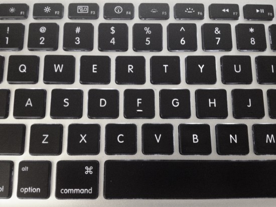
For all physical keyboards, Apple uses a font called VAG Rounded. If you’re reading this page on an iMac or any model of MacBook, look down at the keys and you’ll see VAG Rounded. The font was originally designed for use by Volkswagen, and is recognized for its distinctly rounded end points. Apple debuted its use of VAG Rounded on its keyboards with the original iBook laptop in 1999, and has been used for almost all laptops the company has made since. Eventually, Apple adopted VAG Rounded for all Mac keyboards in 2007.
Before using VAG Rounded, Apple’s keyboards were universally adorned with the condensed oblique variant of Univers, aka Univers 57. Longtime Apple users will remember this font for its slender, slanted appearance.
User Interfaces

In all versions of Mac OS X, Apple has used Lucida Grande for UI elements. The Lucida family of fonts dates back to 1985, and is currently used as main body text by many websites thanks to its easy readability. It’s also the font used by Facebook for its logo. (Random trivia: Lucida Grande has no italics version.)

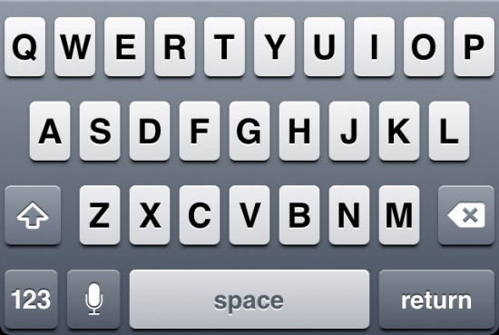
On iOS devices, Apple uses Helvetica for all user interface elements, including things like app titles, menus, and virtual keyboards. iOS devices with Retina displays — namely, the iPhone 4 and 4S, and the third-generation iPad — use the sharper, crisper Helvetica Neue instead, thanks to the screens’ support of anti-aliasing.


19 thoughts on “The Fonts Apple Uses”
Actually, its Myriad Set, an Apple exclusive variant (instead of Myriad Pro). But good stuff.
Helvetica “Nueu”?
Facebook’s logo is actually set in Klavika.
“[Lucida Grande] is also the font used by Facebook for its logo.”
Facebook’s logo is actually set in Klavika.
There needs to be a way to upvote this. I was going to say the exact same thing as soon as I read that.
That’s right, anon. fb uses a modified Klavika for logo. The author meant interface, I suppose.
This article is a complete joke. It can’t even spell HELVETICA NEUE right. Also, these are typefaces, not fonts.
So it’s true that some people exist only to troll. I thought that was just a rumor.
You made a typo. It’s not “Helvetica Nueu”, but “Helvetica Neue”.
*Neue
vag
It’s Helvetica Neue, not Nueu.
The typo and Facebook error have been fixed. Thanks for the heads-up, all. The next time I write a font/typeface related article, I pledge to try harder not to offend the enthusiasts!
I think that former keyboard typeface is not Univers 57, but Univers 48.
I agree with hirofumix. There are several online sources declaring Univers 57 as the keyboard font, but 57 is the upright version. Univers 58 is the oblique version of that weight. However, upon close inspection of many Apple products using that design, such as the Apple IIc, and the Apple Extended Keyboard, it seems Univers 48 more accurately matches the weight and metrics. Of course, I still have yet to find any font that uses the specialized angular ampersand (&) used on Apple keyboards of the time.
Citation Needed
Hi,
I read only this article that speak about “Helvetica Neue Ultra Thin”.
I’m lookin for this font:
https://images.apple.com/macbook-air/images/overview_gallery_design_title.png
Someone could help me?
Thank,
Stefano.
It looks to me like another version of Helvetica Neue. But maybe one of our resident typophiles can identify it more specifically.
Yes, a lot of people think that the two font are the same: https://jonyiveredesignsthings.tumblr.com/
But there a lot of difference. For example the “e” is more “close” in Helvetica Neue.