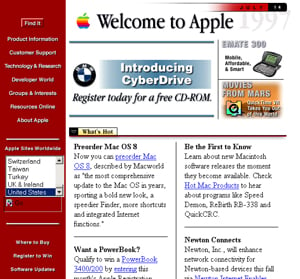
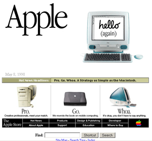
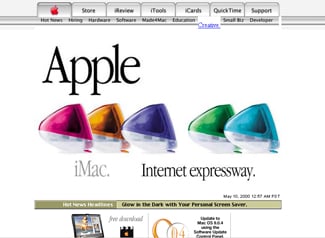
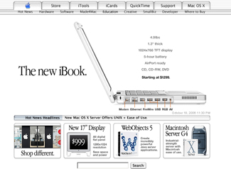
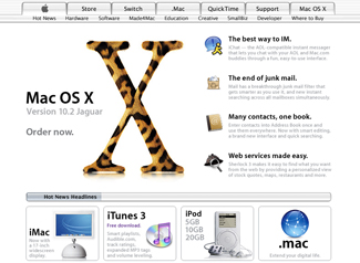
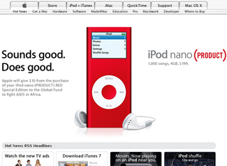
| The Web has changed a lot since 1996. As the Internet has evolved, websites have changed with them, but for most of the last 10 years, Apple.com has look very much the same (at least the front page, anyway). Take a look at how the site has changed from 1996 to now… (by the way, you can click on any of the images below and see the Internet Archive page the screenshots were taken from) | ||||||||||||
|
||||||||||||
| For the better part of a decade, the front page of Apple.com has been, for the most part, unchanged. Do you think it’s time for a redesign, or should Apple stick with what works?I wouldn’t mind seeing the site get a face lift, but that might just be me…feel free to leave your comments below and put in your two cents. | ||||||||||||



17 thoughts on “1996-2006 – Ten Years of Apple.com w/screenshots”
I can’t think of much to improve the current Apple website design. Looks great.
We were actually discussing this very topic at the office the other day (we are an office full of Mac dorks, you see.) I’m pretty certain that the site could use a redesign but the tricky bit is: how? It’s so simple and elegant that I’d be hard pressed to come up with any meaningful changes. The only suggestion I’d make is to go a bit more art-y…but that’s just me.
Awesome Collection.
Very smoothy designs, simple. That’s what i like 😉
It’s worth noting that while the homepage hasn’t changed much, and the global nav tabs haven’t really either, most of the “inside” pages have changed dramatically. The homepage still works well: you can’t miss what they’re trying to show you.
Its funny you posted this, coz I was just thinking the same thing. The site definitely needs a redesign, even if they just ditch the pinstripes (which havent been a part of the Operating System since 10.2).
I’m guessing that 10.5 will bring a new look to the OS anyway and probably a new website to match.
I’m very conservative when it comes to Web design.
Visually interesting Web pages are good but Web pages that work are far better ie. “if it ain’t broke don’t fix it”.
A little tweak here and there wouldn’t go astray but as far as I can see the site works and people are comfortable using it the way it is.
Another downside is that changing it will only make it less easy to use for a returning visitors and one of Apple’s greatest brand strengths is customer loyalty.
Consider The Times of London, This publication has not changed the way it arranges its information for decades, the reason: people know how to find their way around. They’re there for the information not the show.
Thanks for posting this. It’s nice to see 10 years of Apple.com. I think their site is evolving the Apple way. Slight changes here and there but still sticking to what works. The Macbook Pro inherited the Powerbook’s years old design but it still is a great thing to look at and it works. I’d be hard pressed to come up with a better design too. At least a totally new one. Same goes for the site. It might not be as artsy as some of the sites in the web but it works, it’s clean, it’s simple.
They need to create a website that works better for larger browser; it’s plain silly to have a page based on 800×600 in 2006.
Thank for posting this (found it from Digg.com)
You know, I think the site still represents Apple and the designs, simple, sleek, and sexy. It’s easy to navigate around and gets the job done.
If it’s not broke….
Wow! Apple’s first design was ugly!
“mark Said,
Wow! Apple’s first design was ugly!”
It was the first 😉
Darwin, ‘fraid you’ve no idea what you’re talking about when it comes to The Times – they have made wholesale changes and this year moved to a tabloid size and no longer produce a broadsheet version. They’ve changed with the times…
Los cambios que ha sufrido el site han sido innovadores, y son muy placenteros ala vista. En definitivo Apple deberia rediseñar su Web Page, tal vez como la ha hecho hasta ahora, de poco en poco. No me sorprenderia que con el release de Leopard para el 2007, la compañia decidiera hacerles unos ajustes al la pagina.
Apple’s new style:
Black is the new white
Mark my words 😉
Apple redesigns part of the hompage and nav bar on WWDC 07
This set of screen shots is missing a few versions of the site that appeared in 1996. I remember one that was a brushed metal box in the middle of the screen with buttons all over it. It looked horrible. There was a lot of design churn around that time and I think they very quickly fired the bad designers and started getting closer to the overall Apple look and feel.