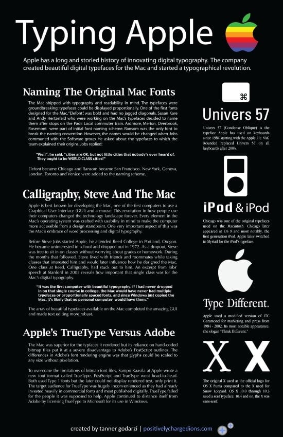
Since the Mac’s inception typography has played a monumental role at Apple. Designing the first digital typefaces for the Mac was influenced by the analog world and later sparked a war between Adobe. The progress made at Apple in developing typefaces has formed digital typography into it what it is today. The info graphic I designed, or as I like to call it, the “typographic” below shows the Apple’s history of typography from the early 80’s to today.
Please click on the image for a larger version.


2 thoughts on “The Typography Of Apple – Typeface Design From 1984 To Today (Infographic)”
The bit on TrueType is both editorializing and generally wrong. Postscript fonts could not be displayed on-screen without Adobe’s ATM software; TrueType could be displayed on the screen and print. For this reason it _succeeded_ in the home/business desktop publishing area. The pros would use Type 1 fonts (and Type 3) for quite some time more, but everyone else was using TrueType.
For a poster about type, that’s a pretty big hangup…
Bob, TrueType could display rendered Type 1 fonts on screen.