
Just how rich is Apple? Well, it depends on what measure you are looking at. Last year, Apple’s revenue was $170.910 billion, with its total assets amounting to $207 billion. No wonder they have all the money to deal with those lawsuits, huh?
But where does all that money come from?
To save you all the trouble of doing your research and spending too much time in front of your computer (and inside the house), Ed Bott of ZDNet has done the hard work.
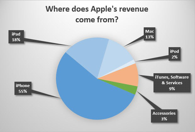
Here’s the result – a handy chart that breaks down Apple’s revenue sources.

I suppose the iPhone being the major source does not come as a surprise to anyone, does it? An interesting question is, years down the road, where will the iWatch be found in this chart?
While we’re at it, let’s look at these two other charts which tell us how Google and Microsoft make money.
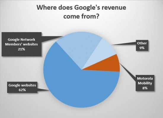
Again, no surprise here. You are probably wondering about “Others”…this category is supposed to cover digital content and non-Motorola hardware products.

As for Microsoft, we see that they really make their living out of commercial licensing, but with all the changes the company is going through at the moment, we might see significant shifts in the future.


6 thoughts on “This Chart Shows Where Apple’s Money Comes From”
Interesting to see this – thanks! I’d love to see the same breakdown, but from a profit & loss stand point. Revenue is one thing, but profits are king!
I think the third chart could bear some elaboration. So could the google chart.
The apple chart helps illuminate how much of a market share the iPhone hardware takes up (and how small iTunes sales are, really surprised there).
but the other two are a little vague about ‘websites’ (what kind?) and ‘licenses’ (can we be more specific,?
Good start, but needs a lot of work still, not ready for publication.
What is the Google chart supposed to show? Is it all ad revenue? So 62% of it’s ad revenue is generated on Google owned websites? Is Android not a part of any of it? Interesting otherwise, thanks
Quite sad since Apple used to be a computer company.
Now, they sell overpriced phones with glass screens, LOL.
Quite sad since Apple used to be a computer company.
Now, they sell overpriced phones with glass screens, LOL.
Talk about a company that has lost focus.