
Love it or hate it, the flat look is here to stay with Apple. iOS 7 was a gigantic leap in the mobile OS’s look and feel, which made for a real love it or hate it feeling amongst Apple fans.
With OS X 10.9 Mavericks the flat look as started to sneak in little by little and doing away with the skeuomorphic items from previous iterations of the operating system.
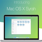
Designer Danny Giebe recently posted a few concept images that show what would happen if OS X caught the flat design bug from iOS. His ideas are some of the best I’ve seen yet and could actually be the best way of getting congruity between iOS and OS X without making too many enemies.
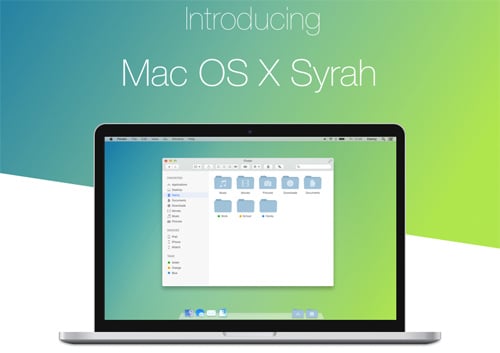
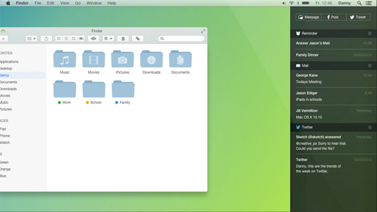
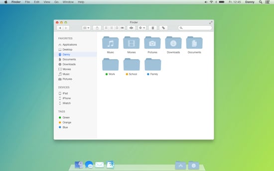
The colors in these renderings are subdued and based on the flat design of Contacts and Notes that came with OS X Mavericks. You should notice the title bars have a slight translucence and the icons have a much flatter, iOS-ish look.
Why Isn’t It Flat Yet?
Once you start using iOS 7 you begin to notice a pretty big difference between how it and OS X Mavericks looks. Jony Ive took charge of iOS 7’s design and the simplicity of it is easy to see. Gone are the gradients and shadows and in are the flat, stacked views.
So why didn’t Ive make Mavericks match it? Well the most likely cause is that doing one complete redesign and relaunch per year is just about all any company can handle, even Apple.
The big change will most likely be seen in OS X 10.10 Syrah, after iOS has had some time to work its bugs out and the smaller design changes take place.
What Will Change?
So if Apple does indeed go flat for 10.10, what all will change? The major changes should be seen in the system apps and Finder windows. Items like Finder and iPhoto will most likely get the flat treatment while items like the menu bar and Dock will stay mostly the same.
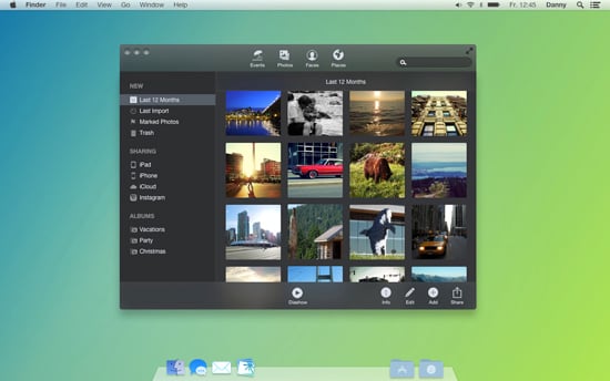
As you can see from Giebe’s rendering above, Apple would most likely not go the super bright color route they did for iOS 7, but instead tone things down a little with sharp edges and a nice, stackable look.
RELATED: iPhoto Sucks: Replace it With These iPhoto Alternatives
The Dock will most likely lose its reflective quality and take on a more blurred and translucent appearance, but I doubt that Apple would mess with the signature Dock too much. The same goes for Finder. While the stacked, translucence will most likely be present, Apple won’t try to change too much.
Redesign and Relaunch
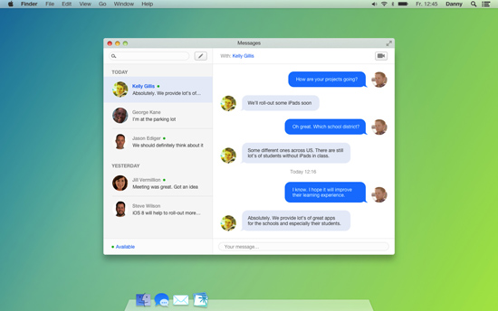
One thing that Apple should take advantage of with a system redesign like the ones pictured here is to relaunch some apps that have fallen by the wayside. First we have Messages. This was meant to be a seamless way to sync messages from your iOS device and your Mac, but in actuality it syncs poorly and doesn’t work very well at all. Fixing this and making it far more useful while making it look better would be a great idea for Apple.
Back to iPhoto, it would be nice to get a far better version of iPhoto with the redesign as well. Faster and smoother are the themes that Apple should be following so the apps work as well as they look.
SEE ALSO: How To Back up and Restore Boot Camp Partitions
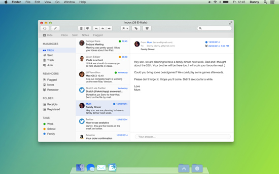
OS X Mavericks all but killed Apple’s default mail client, so a design change and functions overhaul seem to be necessary for 10.10 Syrah, too.
When is it Coming?
OS X 10.10 Syrah is expected to be released sometime in the fall of 2014, so we definitely have some time before it’s in our hands but for now we can just hope that Jony Ive has something like this in mind because this idea truly is beautiful.
Check out Geibe’s renderings here and let us know what you think about them in the comments below.

5 thoughts on “Will OS X Tout The Flat Look for 10.10 Syrah?”
It can’t come soon enough if it does away with black on gray on dark gray theme of Safari which becomes less readable when it is selected that has caused eyestrain for years. Love the look on iOS7. Can’t wait for a version of that in OSX.
I agree totally. Some people might hate the flat look but personally I for one welcome our flat layout overlords.
Sooo…. basically, to me, Apple is going GNOME?
Yes…seems like it. I just tested out the osx yosemite and honestly, i don’t like it. The login screen look just like ubuntu as well.
I grabbed the beta recently myself and I’m not sure if I like it or not. Seems like this idea above was mostly right, but I guess we’ll see what comes in the final release.