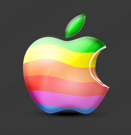
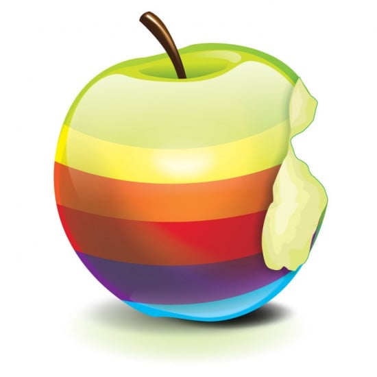
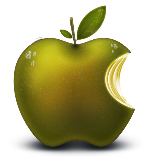
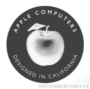
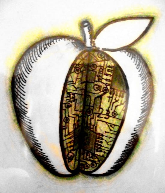
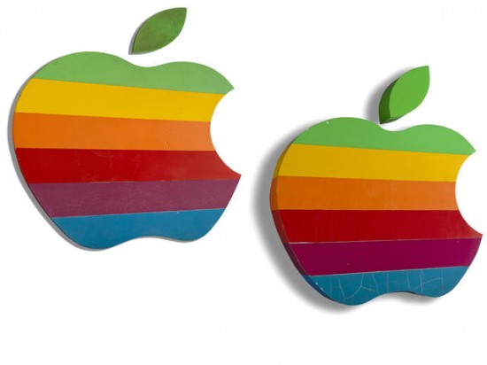
What if Apple’s logo underwent a major redesign? What might that future logo look like? Here are twenty artists’ interpretations of what could come next.
Which one is your favorite? Take a look at all twenty and sound off in the Comments area at the bottom of this page.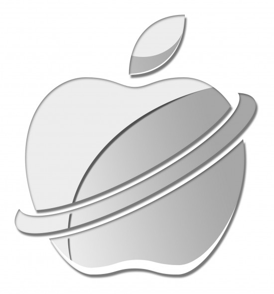
[Image credit]
[Image credit]
[Image credit]
[Image credit]
[Image credit]
[Image credit]
[Image credit]
[Image credit]
[Image credit]
[Image credit]
[Image credit]

[Image credit]
[Image credit]
[Image credit]

[Image credit]



8 thoughts on “Redesigning the Apple Logo”
Most of these feel like a generic icon or logo treatment was applied to Apple, instead of anything that represents the brand and could be carried across product lines. The CGI grab is definitely cool; it just doesn’t feel like it would be appropriate as the corporate icon.
Apple’s existing logo is perfect just the way it is. It is instantly recognizable in its simplest form, say as a black apple on a white backdrop, or vice versa.
Not to mention all those lit up logos on MacBooks that appear in a multitude of TV programs.
Can’t get much better than that.
Most of these are unusable. For one reason. A good logo must look good in monochrome profile and in small size. Only neon would come close.
Just to clarify… Apple has no intentions of changing its logo that we are aware of. This was intended as merely a fun, “what if?” image gallery, and nothing more.
Oliver: We didn’t hire artists to create these. They were found on the Web at various sources, such as DeviantArt, Behance, and Flickr. If you look beneath each image, you’ll find a credit link back to where each one came from.
Some of the images were actually labeled as that artist’s take on a “redesigned Apple logo.” Some were just fun twists on the existing logo. But none of them are meant to be taken as anything that’s under consideration by Apple.
So relax, everybody. It’s just for fun!
These are horrible… Apple’s logo is iconic and highly recognized. Losing that equity would be huge mistake. The only change I’d like to see from Apple would be reverting back to a flat apple. The current “glossy, metal whatever” thing they’ve got going on is needless decoration. Anything else, especially the images above would be a tragic.
No, I love the way it is and please don’t change.
Its perfect as is. These are all hideous attempts of being any logo for any company. Basic branding and identity techniques are not even hit on any of these ugly designs. Where did you find your artists? from Craigslist or Logomaker.com?
I don’t get this website but I like the pictures of he apples