I’ve identified eight basic geometric shapes that Apple comes back to time and again in their product designs. Can you guess them all?
1) Rounded Rectangle
Steve Jobs’ love of rectangles with rounded-off corners is well documented. It was his favorite shape, and he saw to it that it was used in dozens of designs over the years. And not just in Apple’s hardware. Look no further than the virtual buttons and windows on the screen of your iMac or MacBook to see those rounded corners baked right into OS X. Every icon on your iOS screen is a rounded-off square. Apple’s most popular products of today all incorporate rounded rectangles, including iPhone, iPad, iPod, iMac, MacBook (above), Apple TV, and more. Even smaller design elements within Apple’s bigger hardware products are made in this shape; just look at the keyboard and trackpad of your MacBook.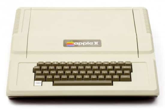
But lest you think this is a recent development, consider this. Jobs’ and Apple’s love of the rounded rectangle goes all the way back to the company’s beginning. See for yourself: just look at the footprint of the Apple II computer (above).
2) Circle
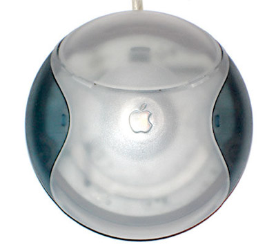
Though not as prevalent as the rounded rectangle in Apple’s designs, the circle nonetheless is a core element. In hardware, Apple’s first major circular product was the reviled “hockey puck” mouse (above) that came with the original iMac. The overhauled iMac 2 with its swiveling screen, aka the “iLamp,” has a circular base that’s actually a half sphere (the one and only time Apple has ever used a sphere shape). But Apple’s most famous use of a circle was the clickwheel on the iPod (below). This ingenious interface, which became touch sensitive in later iterations, was Apple’s solution to scrolling through one’s music collection, and it’s become synonymous with the iPod itself. Echoes of the clickwheel are still in use on things like the tiny button wheel on the iPod Shuffle and the remote that comes with Apple TV.
In software, current-gen OS X app icons like iTunes, Mac App Store, Launchpad, and others are circular.
3) Tapered Edges
Steve Jobs always believed that thinner was better. Didn’t matter what the product, if it had Apple’s name on it, Jobs wanted it to be as thin as physically possible — and much thinner than anything the competition could offer. One technique designers have used for ages to convey a sense of thinness is by tapering a product’s edges. It’s a bit of spacial slight-of-hand that isn’t really necessary to contain the product’s innards. It’s a purely aesthetic touch.
The most famous example of Apple’s tapered edges is probably the iPhone or maybe the iPad (top). Even the iPod Touch has gotten in on the tapered action. But the most extreme example has to be the MacBook Air: the whole thing is one big taper (above).
4) Gumdrop
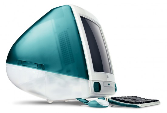
After Steve Jobs’ return to Apple in 1997 and subsequently being named interim CEO, he dug the company out of its financial hole by betting big on a brand new, consumer-level, all-in-one desktop computer called the iMac (above). Since flatscreen displays weren’t cost-effective yet, Apple would need to incorporate a traditional cathode ray tube into its design. Jobs’ top designer, Jonathan Ive, brought him a design inspired by candy colors and a reimagining of the cathode ray tube shape. The result was lovingly dubbed by fans as a “gumdrop” shaped desktop computer.
The design proved so popular — it got Apple out of the red and turning a profit again — Apple would reuse it for a few other product designs, namely the eMac and Studio CRT Display.
5) Oval
After the fun-looking but wildly non-useful hockey puck mouse, Apple decided to do something a bit more grownup for its next mouse. Enter the Apple Pro Mouse. It was a whole new take on how a mouse should operates, ditching the main buttons altogether and making the entire device clickable. It also had the distinction of being Apple’s first oval-shaped device. The oval was something Apple had never so much as dabbled in, unless you count some on-screen buttons built into OS X. Later, Apple would reuse the same form factor for the Mighty Mouse (above), which lost the acrylic shell of the Pro, and added a tiny scroll ball. The next successor was the current-gen Magic Mouse, which I suppose you could call an oval, but to me looks more like a reeeeeally rounded-off rectangle.
6) Cube
The PowerMac G4 Cube (above), another Ive design, won awards for its elegant form factor. The cube-shaped powerhouse rested inside an acrylic shell that both protected it and added to its smooth, futuristic look. The Cube’s square footprint would later be echoed by the Mac Mini and Apple TV, though those computers were not cubes.
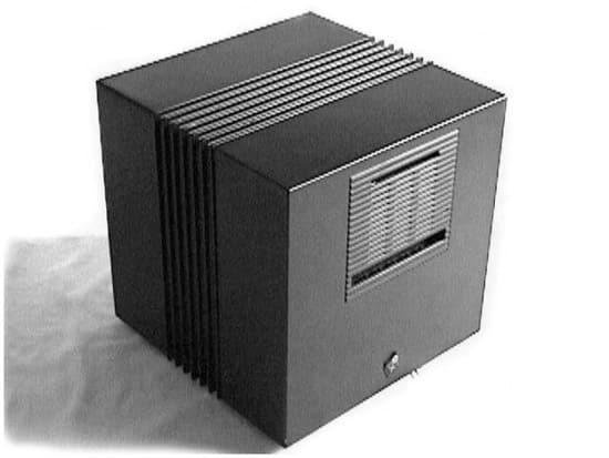
One other cube-shaped footnote in Apple history was a computer designed and sold by NeXT, the company Jobs founded when he was forced out of Apple. Called the NeXTcube (above), it was a high-end workstation that had a magnesium casing.
7) Clam
While most of Apple’s laptops have been variations on that all-important rounded rectangle, Apple took a big step outside the box with the release of the original iBook (above). Designed as the notebook version of the gumdrop-shaped iMac, it featured similarly translucent and candy-colored plastic components, and was the first laptop on the market to come with WiFi built in, standard. It was also probably the most oddly-shaped laptop the world had ever seen, quickly earning the nickname of “clam shell,” its rounded/tapered edges giving it a clam-like shape. Though popular, Jobs & Co. came to see it as looking a bit too much like a toy computer, and dumped it in favor of a more traditional notebook shape.
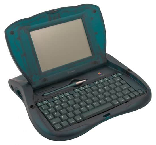
One product that modern Apple fans won’t recognize also featured a clam shape, and that was the eMate 300 (above). The eMate was essentially a fancy Newton PDA with a fold-out screen and keyboard. And it looks less “clam-like” than the iBook. But the eMate’s influence on the iBook’s design can’t be denied.
8) Teardrop
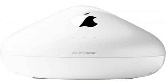
Only one product in Apple history has ever utilized a teardrop shape: the AirPort. Announced alongside the iBook, the first AirPort, known then as the “AirPort Base Station,” came in a gray, “graphite” color that made it look like a partially melted Hershey’s Kiss. A second-generation model was released two years later with newer, faster technologies built in, that updated the color to white, but kept the teardrop shape. This station was followed a little over a year later with the AirPort Extreme Base Station (above), which featured the same design as its predecessor. The teardrop shape was kept for over seven years, until the flat, square shape was adopted that Apple still uses today.


